Going Beyond Pie Charts: More Ways to Use Visuals
 “Love pie. Hate pie-charts” is a playful quote from a talented data designer featured below. It captures the we-can-do-better attitude of the individuals and organizations leading the charge for clear and effective visuals to get your point across. After an enthusiastic response to my post on using visuals, Leslie encouraged to me to continue this topic and showcase a few more dazzling visual examples for inspiration.
Let’s look at some examples of data visualization — also called information visualization and information graphics or infographics. (They are closely related and for our purposes it’s not worth distinguishing the differences.) What’s important to us is how these examples use visual means to convey information clearly and in memorable, creative, and often humorous ways.
9 Places to Find Amazing Data Visualization Examples
The World of 100 project by Toby Ng Design uses simple graphics to explain demographic relationships in global society. For example, in Skin Colour a zebra’s stripes show the proportion of white and non-white people in the world. In Nationality a world map shows continents drawn to scale with their population, which makes it easy to see at a glance where most of the world’s population lives.
Takeaway: You can do this! The “100 method” is powerful and it’s easy enough for any of us to use. Take a look at the World of 100 project visualizations (and the Twitter example cited below in #4) and you’ll see how to apply it to your own visualizations. It’s an effective and simple way to make a compelling point; it reduces complexity and focuses on things people can easily relate to and that capture their imagination. We can all picture one hundred people.
2. Not Just Another Pretty Picture
Especially for libraries: “An exploration of visualization techniques that can help libraries make a compelling case to stakeholders and get insight about how data visualization can help libraries make more informed decisions.” This is a blog post by Hilary Davis in the In the Library with the Lead Pipe blog (November 2009). It’s a fantastic resource with an overview of data visualization, visualization tools, and recommended visualization blogs.
3. FlowingData
FlowingData is the visualization and statistics blog of Nathan Yau, a UCLA PhD candidate in statistics with a focus in data visualization. In his own words: “I highlight how designers, programmers, and statisticians are putting data to good use.” He is prolific in posting outstanding data visualization examples from other sources annotated with his personal insights, and he posts his own projects and experiments with data visualization. The topics span the gamut from 7 Basic Rules for Making Charts and Graphs to History of the Beatles as told by their hair, in more than twenty categories like Infographics, Statistical Visualization, and Data Design Tips. Tip: Categories are not listed on the home page. Click on a category link in the byline of any post to get to a page with the full list of categories.
The blog’s tagline is “Ideas, issues, knowledge, data — visualized!” Stunning examples by London-based data journalist and data designer David McCandless include The Hierarchy of Digital Distractions, If Twitter Was 100 People, and his recent visualization based on Clay Shirky’s writings on Cognitive Surplus. In his words: “My pet-hate is pie charts. Love pie. Hate pie-charts.”
5. xBlog: The Visual Thinking Weblog (category: data visualization) (https://www.xplane.com/xblog/category/data-visualization)
XPLANE’s xBlog is “widely respected as a definitive resource for designers, visual storytellers and information architects. You’ll find links to sites discussing visual thinking, web design, art, creativity, information architecture and design, graphic design, symbols, typography, photography, information graphics, illustration, interface design, usability, language and more.” I found the actual design of the blog a little difficult to navigate; I wasn’t sure where to click, but the content makes it worthwhile.
XPLANE’s (https://www.xplane.com/company/about) mission is to create understanding. They clarify complex business issues through visual collaboration. Their tagline is “The Visual Thinking Company.” In their own words: “We visualize clarity.” XPLANE was founded by Dave Gray in 1993 and is now the leading design firm focused on information-driven communications.
6. VizThink (http://www.vizthink.com/)
VizThink is a community focusing on infographics, sketching, and presentations. You can join their email list and find out about conferences, classes, and other news. In their own words: “VizThink is a global community for visual thinkers and communicators who like to get beyond words and believe that visuals can be an effective tool whether you’re just trying to work through your ideas or working to get your message across as simply as possible.”
7. Smashing Magazine’s Data Visualization: Modern Approaches
Vitaly Friedman, who wrote this post in 2007, is editor-in-chief of Smashing Magazine and a successful designer. Some of the topics covered are mindmaps, displaying news, displaying data, displaying connections. Caveat: Since this is a static blog post and not a blog continuously posting new examples, these examples may be slightly dated. Tip: Smashing Magazine, which began in 2006, is a great resource for web design tips for designers and developers.
The Cool Infographics blog by Randy Krum “highlights examples of data visualizations and infographics found in magazines, newspapers and on the Internet” and includes a useful list of Cool Links of other data visualization and infographics blogs. In his own words, he’s “always looking for better ways to get the point across.” His logo, a smiley face with sunglasses (similar to the Yahoo “what’s cool” icon from the 1990’s) started making me crazy after a few minutes, but he admits he’s not a designer, so I can’t hold that against him.
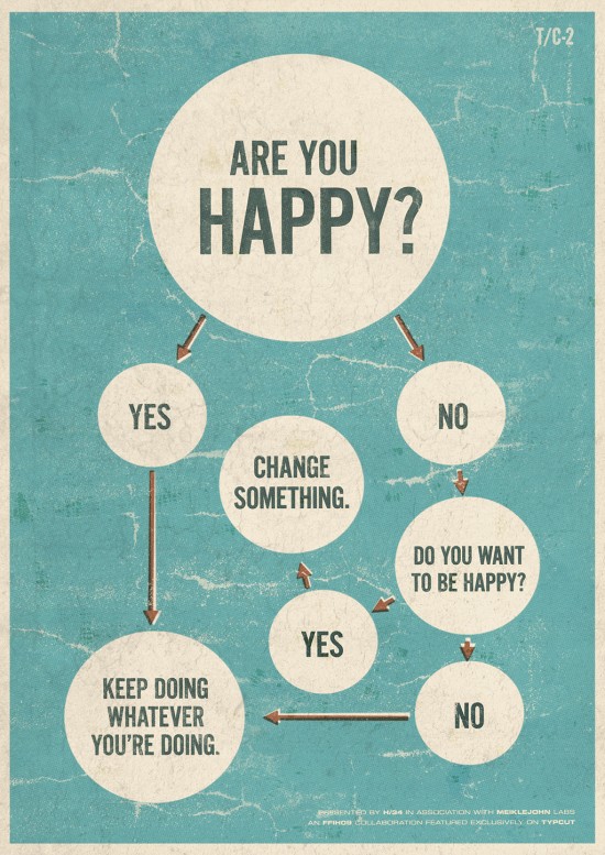
9. Flowcharts are a good place to start. Last but not least, I couldn’t resist including a couple of humorous flowcharts. Flowcharts are a simple way to communicate visually and most of us have created at leastone. A key principle in designing flowcharts is “reduction” — eliminating as much extraneous information and design elements as you can. And have some fun!
Do you need a new logo? (flowchart) — One of the decision points in the center of the graphic is “Does your logo use clip art?” and one of the possible answers is, “Wait, clip art is a bad thing?”
Bacon Flowchart — Needs no introduction.
“As intelligence goes up, happiness goes down. See, I made a graph. I make lots of graphs.” — Lisa Simpson. The Simpsons. Episode 257. January 7, 2001. Source: FlowingData.
Now, It’s Your Turn
1. Check out one of the examples above and try your hand at inventing your own ways to visualize data.
- Start with the “100 method” or do a simple flowchart.
- Many visualization images can be reused for non-commercial purposes. Find some favorites to use in your presentations.
2. Carry a camera everywhere and take photos of things that inspire you. It’s an easy way to capture ideas, to train yourself to really look at things, and to think visually. Since cameras are built into most mobile phones, it’s convenient. For example, I take photos of houses in San Francisco that are adjacent to each other and identical in architecture but have been decorated differently over the years. I tag this photo series as “twins.” It’s a treasure hunt for me and it trains me to spot subtle differences — like those “what’s different in these two pictures” books that we enjoyed as kids.
Image credit: Are you happy? flowchart by Alex Koplin and David Meiklejohn at (h34dup.com)