Use the Power of Visuals to Get Your Point Across
 Some people are brilliant at melding words and visuals. Most of us struggle to create engaging presentations, documents and web pages. We’ve all been told it’s crucial to appeal to visual as well as verbal thinkers, but knowing how to do that seems mystifying at times.
It’s not as hard as you think. Let’s get inspired by a visually stunning example, then I’ll offer a few tips to help you punch up your own visuals. You don’t have to be a design genius; the trick is to borrow respectfully from the best and teach yourself to improve over time.
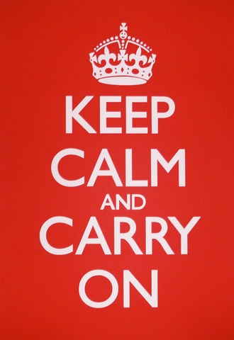
Keep Calm and Carry On was a World War II slogan in England. It’s had a recent resurgence in the design world (do a search in Google Images on that phrase to find some creative variations) and it’s a great example of a powerful visual. Maira Kalman, our design inspiration below, pays homage to it in her blog.
Tell A Story
What makes Maira Kalman’s blog And the Pursuit of Happiness so amazing is her talent for storytelling and her expertise at interweaving writing and illustration. Kalman uses words sparingly, considering the ground she covers –- a history of American democracy. Her words draw a thread among the elements of the story, unfolding in a continuous stream as you scroll down the page. At the heart of Kalman’s style is her inclusion of quirky and unexpected tangents. How else could an homage to George Washington include a snapshot of napkin folding? She takes you by surprise with her juxtaposition of different media –- paintings, drawings, photographs, calligraphy –- and her unique way of elevating everyday and even silly things to a noble level.
Lesson: Find an interesting way to tell your story. Don’t be afraid to look at things from a different perspective. Experiment with mixing media, but find a common thread. Kalman’s common thread is her beautiful handwriting. She chooses a stark black background to contrast against her white writing and colorful images. Her writing takes the form of an ephemeral message scrawled on a chalkboard and it beckons us to follow it.
8 Tips to Make Your Point with Visuals
1. Avoid clip art. We’ve all used cheesy clip art illustrations at some point. These illustrations come with Microsoft Word, PowerPoint and other design software. They rarely add anything to a document and can make your work look downright silly. It’s even worse to pepper multiple clip art images on the same page shotgun style.
2. Pay attention to your text layout. Before searching for images to bring life to your document or presentation, focus on making your text and layout visually engaging. Think about magazine layouts: they use call-outs, columns, and scaled font sizes to differentiate among page elements.
Font size differences should be decisive — differences of at least two to four points are easier to discern. For example, a typical website uses the font sizes shown below to create an obvious hierarchy.
- 9 point – text you want to minimize (captions, disclaimers)
- 11 point – most content
- 14 point – labels on grouped items
- 20 point – major headers/titles
Last, but not least, emulate professional designers and treat white space (the space around objects) as sacred –- leave plenty of empty “breathing space” in your layout.
3. Use one large image rather than a bunch of small ones. It’s visually compelling. The California Digital Library website does a nice job of this on the home page.
4. Match your point and your tone to your visuals. An image doesn’t have to be completely literal. I laughed (and drooled) at the image on this gift certificate web page (http://store.mcsweeneys.net/index.cfm/fuseaction/catalog.giftcertificates/McSweeneysGiftCertificates.cfm). It doesn’t have anything to do with the product, but you get the point immediately. For this blog, Leslie and I select images that convey the main concept of the post. Our post on personal branding, How to Discover Your DNA, used an image of six goldfish with one fish a different color to show individuality. We could have used the classic double helix DNA image, but that would have missed the point of the post.
5. Don’t use too many colors to differentiate your data. Consider this when you are creating charts: Extra colors create extra cognitive work because our brains must try to figure out the scheme. One color is optimal; it reduces search time for your brain. It may seem counter-intuitive, but more color adds less value. At seven colors, your brain’s performance degrades significantly. Choose a neutral color (black, gray, brown, etc.) and one contrasting color for emphasis (red, orange, green, pink, blue, etc.). Make sure the contrast color is dark enough and stands out sufficiently to be immediately noticed.
Try to figure out what’s important here
Try to figure out what’s important here
Try to figure out what’s important here
It’s clear what’s important here
It’s clear what’s important here
It’s clear what’s important here
6. Quality matters. Never scale up a small image; it will look terrible. Choose images that look crisp. For a few dollars you can purchase a stock image, which is a good option if you intend to publish an image on a website or in an article. Search for the phrase “stock images” to find vendors. For free images, try Wikimedia Commons or Flickr. For historical photos, try University of California’s Calisphere.
7. Use video and animation. A picture may be worth a thousand words, but video is priceless in getting your point across. It engages both our visual and auditory senses. Grab a Flip, iPhone or video recorder and make your own video. An easier option is to simply embed or link to others’ videos from YouTube, Vimeo, or other sources. Animoto is a free way to turn images into an animated slide show video. Flash is a relatively easy way to add motion to your website. The California Academy of Sciences has a fun Flash video on their home page.
If I could only give one tip, it would be this one:
8. Copy designs you like. Professional designers do this all the time. Find visual examples you admire and save them as reference for your own designs. Take a screen shot of a particular aspect of a design or save the whole thing. I keep a folder on my computer called “design inspiration” to capture visually compelling reports, presentations, and screen shots that focus on one element. Add a word or two in the filename — buttons, layout, color, or wording — for ease of finding later.
“A picture is worth a thousand words. An interface is worth a thousand pictures.” — Ben Shneiderman
Now It’s Your Turn
- Take a fresh look at documents, presentations and websites with an eye to the visual. Decide what’s pleasing to you and why. Keep a folder of compelling visuals. Don’t forget, it’s OK to find something you like and use it as a template; you don’t have to be creative from scratch.
- Ask yourself what you’ll do next time you create a presentation for work. Always keep in mind why you are doing it, who you are doing it for, and what your goal is so you can engage in the right way — fabulous visuals and poor writing will get you nowhere.
- Look at Nancy Duarte’s great advice on designing meaningful presentations.
- website: Duarte Design
- videos: Five Rules for Presentations and Slide:ology (highlights from her book on creating inspiring presentations)
- Take a class on visual thinking at VizThink (http://vizthink.com/blog/category/vizthinku/).
- Take a 3-day overview class in Visual Interface Design at Cooper.
- If Maira Kalman enchanted you, check out her TedTalk video